


Summary (TL;DR)
Market breadth is like a headcount of the stock market. Instead of just watching the headline index (like the S&P 500), it checks how many individual stocks are actually participating in the market’s move. A strong, healthy trend involves lots of stocks moving together; a weak trend is propped up by only a few.
Introduction
It is easy to be swayed by the headlines. “The Dow Hits a New High!” or “The S&P 500 Surges!” These announcements paint a picture of a strong and vibrant market. But what if that picture is incomplete? What if the celebrated rise of a major index is being driven by just a handful of giant companies, while hundreds of other smaller companies are quietly struggling? Market breadth is the tool that allows us to look beneath the surface, to check the health of the entire market, and to determine if a rally is truly as strong as it appears.
A Look Back in Time
The concept of looking beyond the simple price averages is not new. In the early-to-mid 20th century, market analysts like Richard Schabacker, and later the team of Leonard and James Lowry, began developing methods to measure the internal strength of the market. They understood that an index could be misleading. They sought to answer a crucial question: Is the whole market moving, or just a few influential parts? From this pursuit, the first true market breadth indicators, such as the Advance-Decline Line, were born.
The Core Concept (Explained with Analogy)
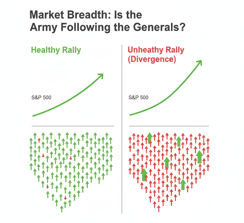
Imagine the stock market is a vast army on the march.
The famous market indices, like the S&P 500 or the Dow Jones Industrial Average, are the Generals. They are large, powerful, and their movements are reported on the nightly news. When the Generals advance, everyone assumes the battle is being won.
However, a wise commander knows the Generals cannot win a war alone. They need the support of their Army the thousands of individual stocks that make up the entire market.
Market breadth is simply the act of counting the soldiers. Are most of the soldiers marching forward with their Generals? Or are the Generals advancing while the bulk of their army is secretly retreating or falling behind?
If the S&P 500 (the Generals) is pushing to new highs, and a breadth indicator shows that the vast majority of all stocks (the Army) are also rising, this is a sign of a healthy, sustainable advance. The army is strong and unified.
But if the S&P 500 is making new highs while our headcount shows that more soldiers are retreating (declining stocks) than advancing, it signals a dangerous weakness. This is a divergence—the Generals have gotten too far ahead of their troops. This kind of advance is often fragile and prone to a sudden reversal.
A Real-World Connection
The Dot-Com Bubble of the late 1990s serves as a classic cautionary tale. In 1999, the Nasdaq and S&P 500 were soaring to incredible new heights, driven by a frenzy for a narrow group of large technology and internet stocks. The “Generals” were charging ahead. However, for many months, market breadth indicators were flashing red. The Advance-Decline Line was failing to make new highs, showing that the majority of smaller stocks, the “Army,” were already in decline. This divergence was a clear warning that the foundation of the rally was crumbling long before the spectacular crash in 2000.
From Theory to Practice
Investors and traders use market breadth to answer two fundamental questions:
- Is this trend trustworthy? If an index is rising along with strong market breadth, it gives investors confidence to stay with the trend. This is known as confirmation.
- Is this trend about to end? If an index is rising but market breadth is getting weaker, it acts as a warning sign to become more cautious. This divergence suggests the underlying strength is fading and a reversal could be near.
A Brief Illustration
- Healthy Scenario: The S&P 500 closes up 1%. You check the market breadth data and see that 420 stocks in the index advanced, while only 80 declined. This is a powerful, broad-based rally. The Army is marching with the Generals.
- Unhealthy Scenario: The S&P 500 closes up 1%. However, the breadth data shows that only 150 stocks advanced, while 350 declined. This means a few mega-cap stocks had a fantastic day, dragging the entire index up while masking the fact that most stocks had a bad day. The Generals are advancing alone.
The Chapter’s Wisdom (Key Takeaways)
- Market breadth measures the level of participation in a market trend.
- It provides a more accurate view of the market’s health than an index alone.
- When an index and a breadth indicator move in the same direction, it confirms the trend.
- When they move in opposite directions (divergence), it is a critical warning sign that the trend may be losing momentum.
AI Image Prompt for Visuals
A clean, modern infographic in a textbook style titled “Market Breadth: Is the Army Following the Generals?”. The image is split into two vertical panels.
- Left Panel: Titled “Healthy Rally”. It shows a green upward-trending line chart labeled “S&P 500.” Below it, an illustration of a large army of small, simple green arrows all pointing up, with only a few red arrows pointing down.
- Right Panel: Titled “Unhealthy Rally (Divergence)”. It shows a similar green upward-trending line chart for the “S&P 500” pushing to a new high. Below it, an illustration of an army made up of mostly small red arrows pointing down, with only a handful of very large green arrows pointing up.The style should be minimalist, using a clean color palette of green, red, and neutral gray, with clear, bold text.
Chapter Glossary
- Market Breadth: A measurement of how many individual stocks are participating in a given move in a stock market index.
- Advance-Decline (A/D) Line: A common breadth indicator that plots the running total of the difference between the number of advancing and declining stocks.
- Divergence: A situation where a market index is moving in one direction (e.g., up) while a breadth indicator is moving in the opposite direction (e.g., down).
- Index: A tool, like the S&P 500, that tracks the performance of a group of stocks to represent the overall market or a sector.
Food for Thought
- If you see the S&P 500 making a new high, but you learn that more stocks went down for the day than up, how does that change your perception of the market’s strength?
- Why is it dangerous for an investor to only pay attention to the major indices without ever considering market breadth?
Additional Topics to Explore
- Stop-Limit Order: A variation that combines a stop price with a limit price to give the trader control over the execution price, though it does not guarantee the order will be filled.
- Understanding Support and Resistance: The Market’s Memory: Understanding Support and Resistance
- Limit Orders: The order type that a stop-limit becomes once it is triggered.